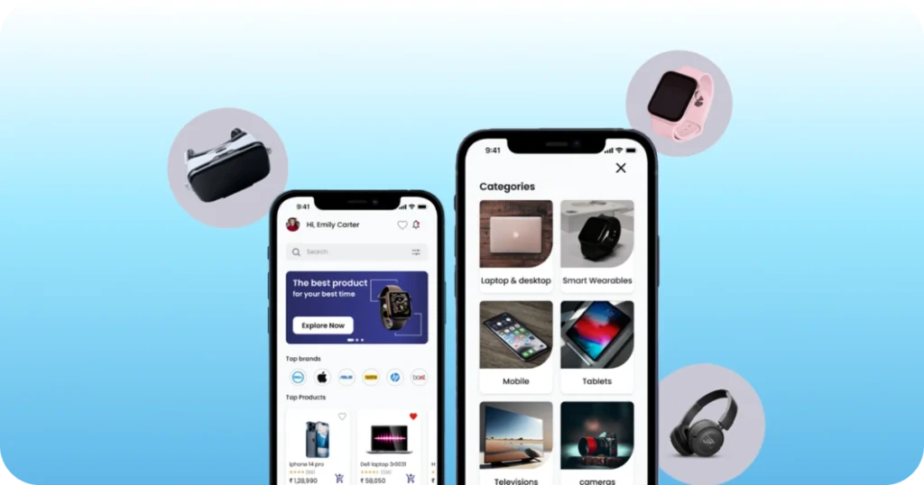
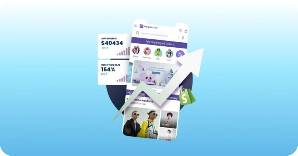
What is App Landing?
As the word says an app landing page is that place where people first “land” when they visit your website. This can be because they followed add, found your site on Google, or simply type in your URL in their browser window. When people land on your site, there are a couple of requirements your app landing page should meet. For example, you should make some nice features so that people can be sure that they reach right place.
Here some tactics of Pre-Launch App Landing Pages:
1) A/B Testing
A/B testing is also called as split testing which is basically, an experiment where you simultaneously test two different versions of a Landing Page. Moreover, it is nothing more than the application of a scientific method to your online marketing efforts. A/B testing is that place where you can easily compare two versions of a web page to predict out which one performs better. In the design, layout, and prominence of certain elements small changes can have a significant effect on conversions.
2) Design For Target User
It means that what you think looks good on a landing page, or what would make you fill in a sign-up form, would not necessarily have the same effect on your target audience. Most mobile app developers have an accompanying site that introduces and describes what their mobile app can do. Some of these sites are truly unique.
3) Ask For Social Shares And Referrals
Social share buttons are popping to help drive traffic and increase referrals. Ask users to share your content. The landing pages that prompt social activity or referrals after someone has left an email get higher conversions than those who ask for them before. Curate perfectly optimizes its ‘confirmed submission’ page. It is so to push people to complete the next desired action – to refer 3 friends.
4) Say Thank You Page
A great “Thank You” confirmation page to get more from your leads after they sign up. The thank you page can also be used as an opportunity to push the sign-up to complete another action, like read your blog or watch a product demo video. Now you can chain your signup page to its own, dedicated, thank you page to deliver digital goods or to increase your campaigns virality.
5) Guide Your Visitors
It is important to guide your visitors because it is a nice thing to help them reach their goals quickly. It is also important because you want them to engage in a certain activity, or take a certain action on your site. Do not leave it to chance whether or not people figure out ‘the next step’ on their own because if you don’t then they will leave you.
6) They don’t ask for information
These are great insights for customer profiling, but just be aware that the longer it takes for people to fill in a form, and the more personal information they have to leave, the lower your conversions will be. Most of the time you have seen that some brands use their sign-up forms to ask for other details like name, gender and where you heard about them.
7) Attention on your Design
A nice design can be the great way to greet new visitors to your site. The visual appeal of a site is great affects our first impression so it is important. The digital media tells us a lot about its quality – at least that’s what we often believe. Make your site more trusty, a beautiful design also makes people curious and hungry for more.
8) Make Product or Service Tangible
Explain & demonstrate your product, so you can make it even more tangible by inviting your visitors to try it out. To your creativity and for many products, there is no limit. It is possible to provide at least some level of realism. It should be with considering the advanced web technologies available today. Your visitors can experience your product or service is not only highly engaging and fun it also gives a good idea.
a best effective way to promote mobile games
9) Appeal
For an effective landing page it the most important aspect. Its dependency is all on your service, identification and personal attachment. You can appeal to your visitors on more holistic level with design elements. You can add strong emotional factor to your design with images or background images.
Source By: #landerapp, #hongkiat, #kickofflabs


